
Configuration and Customization
Overview
This guide provides descriptions, examples, and recommendations related to the settings in your Spaces CMS. Ensure you have completed Installation and Set-Up before continuing below.
Take Note
This guide does not mention every setting available to you in the Spaces CMS. Please primarily follow the information provided in the CMS and reference this document for additional details and examples.
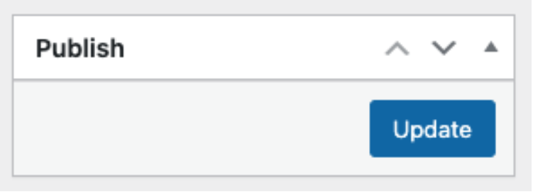
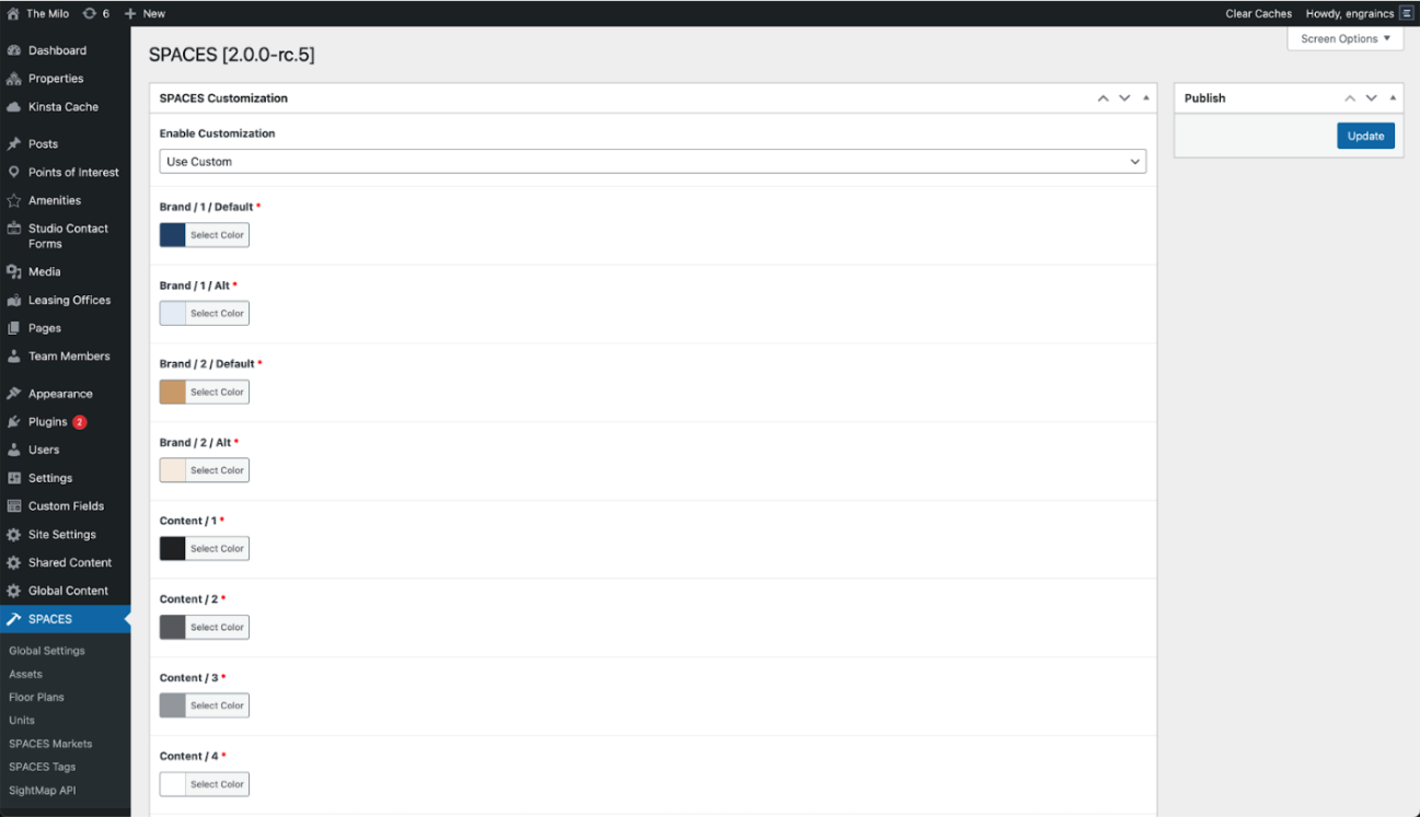
After you make changes in the Spaces CMS, ensure that you select Update. Your updates may take up to 15 minutes to appear on the frontend of your website.
Colors
The Spaces plugin’s colors are customizable to help its search experience appear seamlessly integrated within your website design. It is recommended that you configure your color settings in compliance with the WCAG 2.1 level AA contrast ratio requirements.
Color Tokens
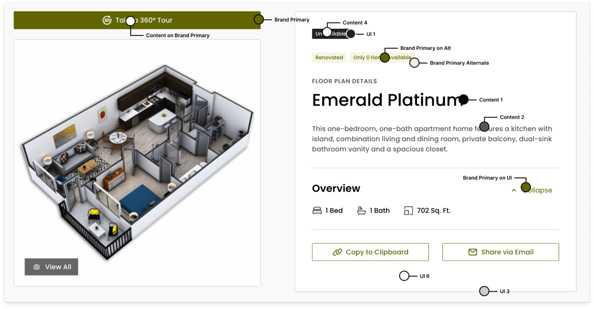
The customization system uses three color categories: brand colors, content colors and UI (user interface) colors.
Brand Colors
Your core or primary brand colors are used to emphasize important elements like calls-to-action.
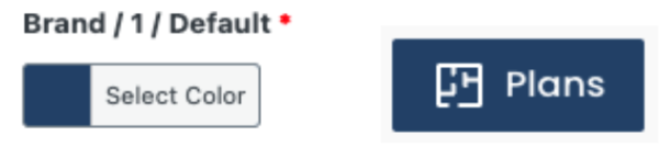
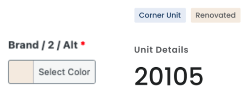
BRAND PRIMARY
Featured in colored button fills.
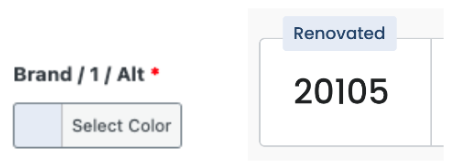
BRAND PRIMARY ALTERNATE
Featured in custom tag backgrounds.
BRAND SECONDARY
Does not currently appear on the frontend.
BRAND SECONDARY ALTERNATE
Featured in secondary/programmatic tag backgrounds.
Content Colors
These are applied to all text and iconography throughout the plugin. Content colors should maintain a 4.5:1 contrast ratio with their respective backgrounds.
CONTENT 1
Primary text color featured in headlines, titles, and section headers. A minimum 4.5:1 contrast ratio with UI 6 is advised.
CONTENT 2
Secondary text color used for all body copy. A minimum 4.5:1 contrast ratio with UI 6 is advised.
CONTENT 3
Does not currently appear on the frontend.
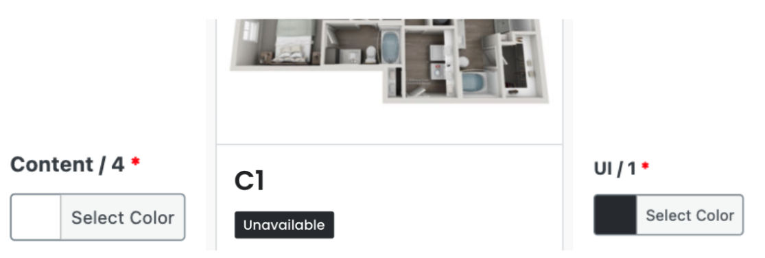
CONTENT 4
Text color used for “Unavailable” tags. A minimum 4.5:1 contrast ratio with UI 1 is advised.
CONTENT ON BRAND PRIMARY
This refers to the color of text that appears on top of elements colored with the Brand Primary. A minimum 4.5:1 contrast ratio with Brand Primary is advised.
BRAND PRIMARY ON UI
Text color used for all calls-to-action in which the background is a UI color. A minimum 4.5:1 contrast ratio with UI 5 is advised. In the event that yourBrand Primary color does not meet the minimum advised ratio, you can set this element to a version of your core brand color that does uphold sufficient contrast.
BRAND PRIMARY ON ALTERNATE
Text color for the labels in all custom tags. A minimum 4.5:1 contrast ratio with Brand Primary Alternate is advised.
BRAND SECONDARY ON ALTERNATE
Text color for the labels in all secondary/programmatic tags. A minimum 4.5:1 contrast ratio with Brand Secondary Alternate is advised.
UI Colors
These serve as the palette for certain element backgrounds and non-content elements like borders and divider lines.
UI 1
Background color for all “Unavailable” tags.
UI 2
Currently unused.
UI 3
Element borders and divider lines.
UI 4
Currently unused.
UI 5
Secondary background for floor plan cards and certain button hover states.
UI 6
Primary background color for all cards.
Global Option Overrides
Use these options to customize how your Spaces frontend appears and configure what information it presents.
For websites that contain one property, the majority of your global settings are located in Spaces >Global Options Overrides.
For the rest of your global settings, navigate to Spaces > Assets > select the asset. Here, you can enter or adjust the online leasing information and your SightMap embed URL.
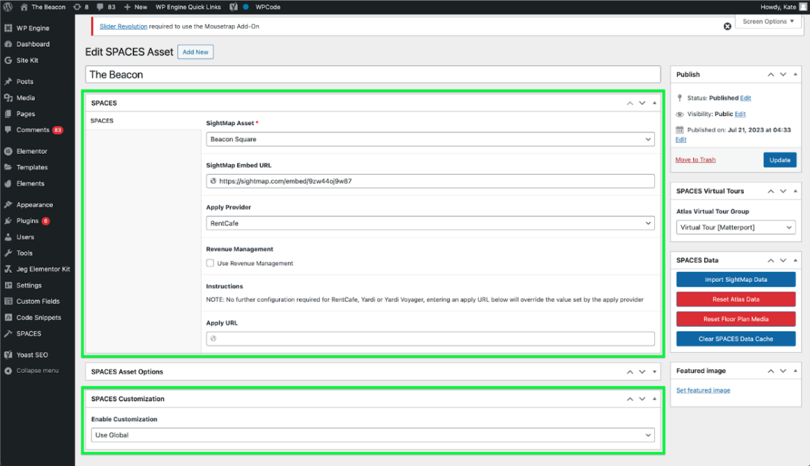
If you have multiple properties on your website, settings that are unique to each property must be configured at the property level: Spaces > Asset > Property.
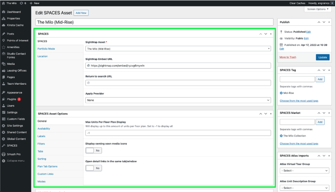
General
MAX UNIT PER FLOOR PLAN DISPLAY
Set the maximum number of units that appear per floor plan. To show all units per floor plan, input “-1”.
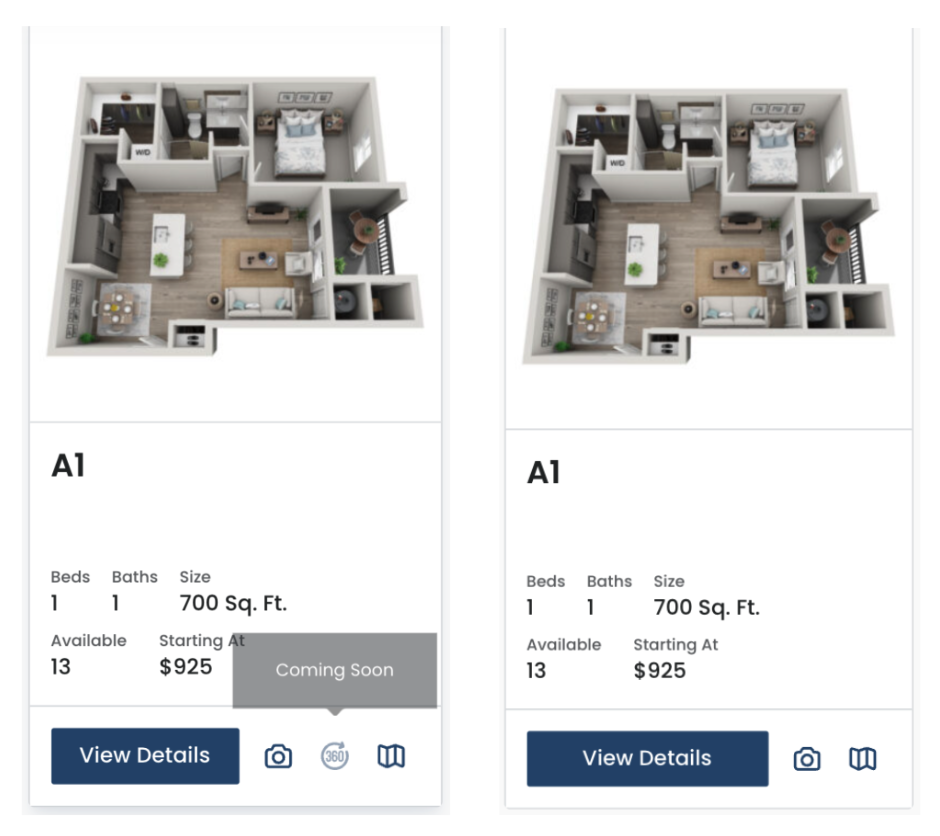
DISPLAY COMING SOON MEDIA ICONS
When enabled, all floor plan and unit media icons will display, with unavailable content appearing as non-interactable. When disabled, only populated media icons will display.
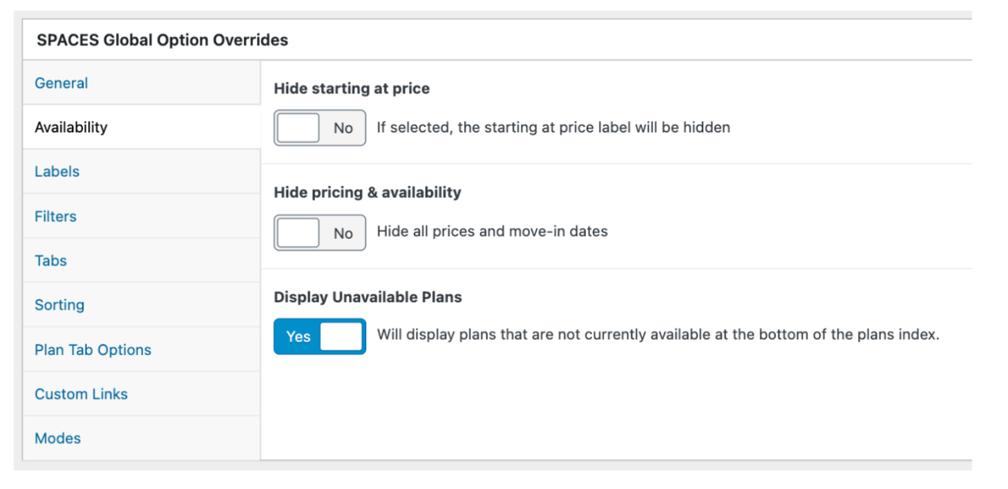
Availability
Use the toggles to disable or enable the display of the “Starting At” price label, all prices and move-in dates, and unavailable floor plans. If the property is in a lease-up or transition period, you may want to hide unit pricing and availability.
Labels
While the Spaces CMS does not limit the amount of characters you can input for each label, we recommend keeping each to around 10 characters or less. The space for button elements and text is limited and adding too many label characters may adversely impact the frontend appearance.
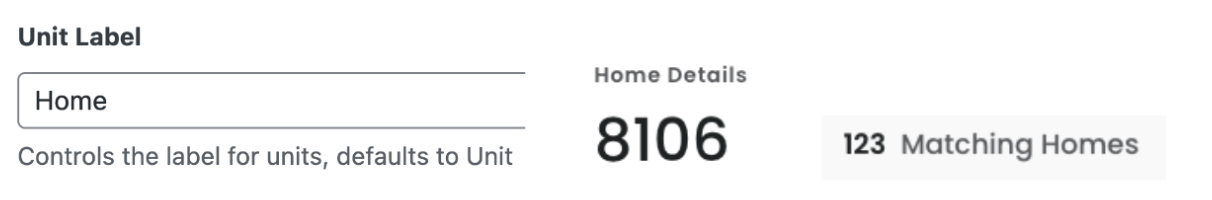
UNIT LABEL
Defaults to “Unit.” You may want to customize it to “Apt,” “Home,” etc.
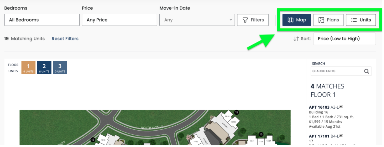
UNIT TAB LABEL | PLAN TAB LABEL | MAP TAB LABEL
These control the labels in the view tabs. The default labels are: “Units, Plans, Map”.

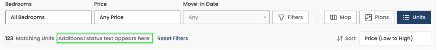
ADDITIONAL STATUS TEXT
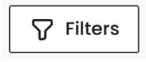
Filters
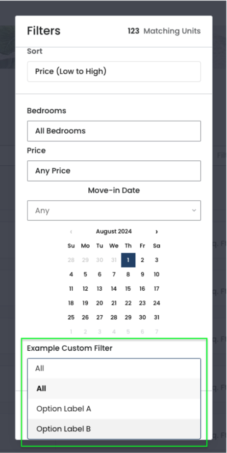
Manage the price, date, and room filters and create your own custom filters. Note that the room filter is required and cannot be hidden.
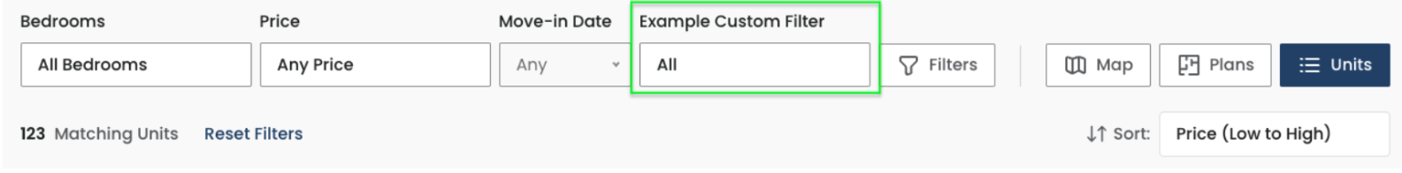
Custom Filters
You can create custom filters and set them to appear alongside the core filters or within the Filters modal.
OPTION VALUE
Please populate the Option Valuewith “.tag-[slug oftag]” Example: “.tag-balcony”
Tabs
Adjust the order of the view tabs or disable them. Ensure that you do not select the same tab in more than one of the dropdowns.
Sorting
Select the default sort order for both the floor plan and unit lists.
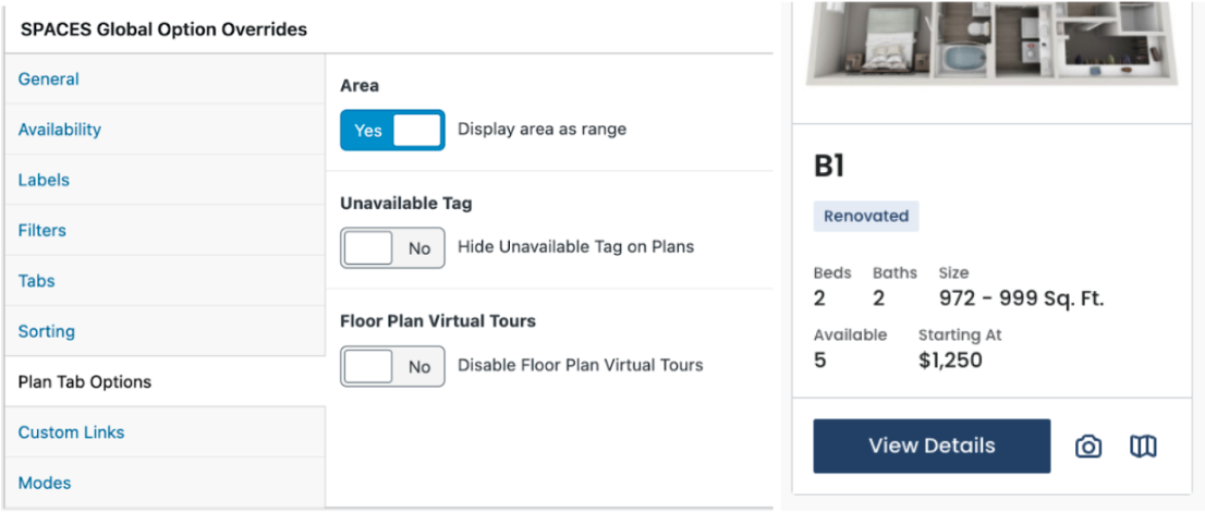
Plan Tab Options
Floor plans can be set to display area ranges or otherwise will display the minimum area value of the units associated with it.
Custom Links
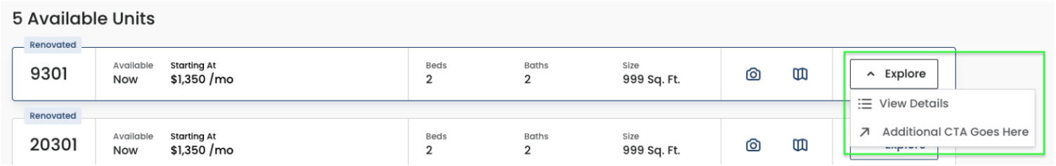
When enabled, you can input an additional unit inquiry call-to-action with link that appears for each unit’s Explore button. The link can open in the same tab or a new tab, as a modal within the page, or utilize a Knock script.
Modes
Debug Mode is reserved for troubleshooting, typically by a website developer. This mode logs error information in the console and displays it on the frontend.
CSS Overrides
If you use CSS overrides to further stylize Spaces, please take note of the following.
The .spaces-override class allows a user to change anything regarding how Spaces looks. The Spaces root element is wrapped in an element with the CSS class of spaces-override. In your theme CSS you can override any base Spaces style with specificity. For example, to change the max width of the Spaces container:
.spaces-override .spaces-container { max-width: 1280px; }However, we recommend continuing to manage the color settings via the Spaces CMS and not overriding them via CSS. Doing so may have undesirable effects as the colors set in the CMS follow our token system and are able to be configured in compliance with WCAG 2.1 level AA contrast ratio requirements.
If you must override the color settings via CSS, all color tokens are managed via CSS Custom Properties which are attached to the .spaces-root element. These properties can be overridden in the theme CSS by assigning new values. For example:
.spaces-root[data-spaces-theme="default"] .spaces-override { --spaces-color-brand-1-default: #12294a; }This would cause the color selected in the CMS to be ignored and the color specified here, would become the brand-1-default.
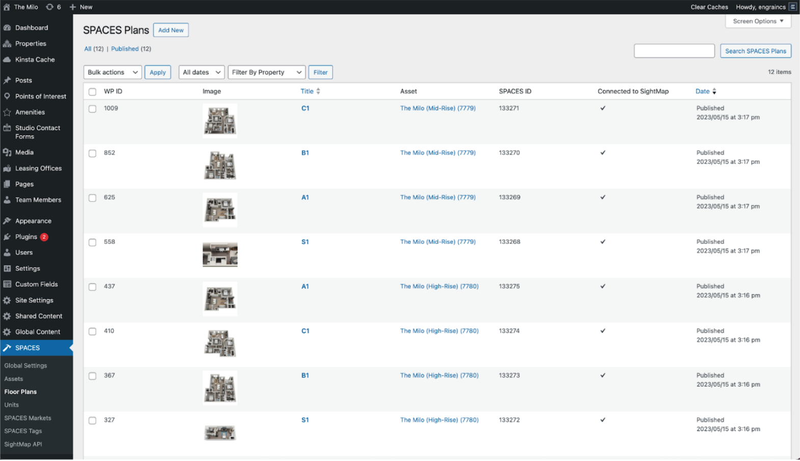
Floor Plans
View and manage floor plans in Spaces. Hover over or select a floor plan title to edit it.
QUICK EDIT
Use Quick Edit to edit floor plan titles or add Spaces Tags, without needing to click into each plan.
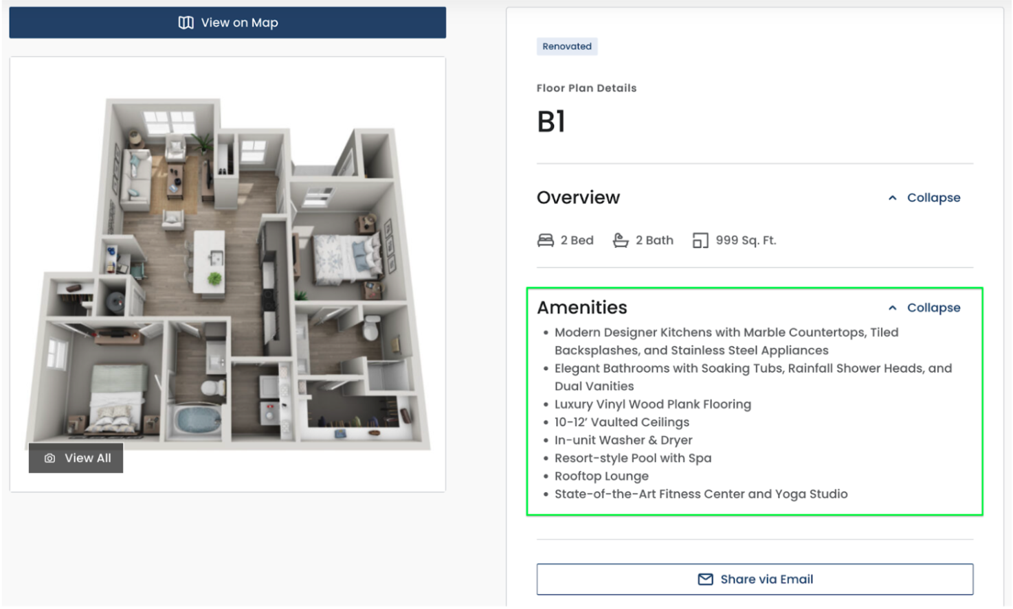
FEATURES
Enter a Floor Plan Description to appear at the floor plan level. This is best used for paragraph-style content. For list-style content, please use the Floor Plan Amenities option.
FLOOR PLAN AMENITIES
Enter list items to appear on the floor plan detail page.
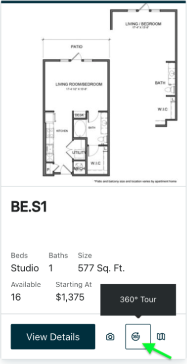
360 TOURS
Virtual tour links are configured through SightMap and can then appear in the Spaces plugin frontend.
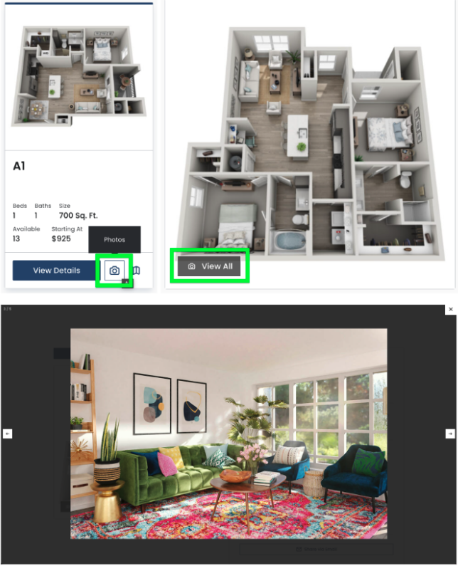
GALLERY
Beyond the featured floor plan layout images, you can upload additional floor-plan-specific imagery.
ADVANCED
This tab is used to assign floor plans to custom filters. A custom filter must first be created in Global Settings > Filters > Custom Filters.
SPACES
The SightMap Floor Plan ID and SightMap Asset ID are automatically populated during the data import and should not be altered.
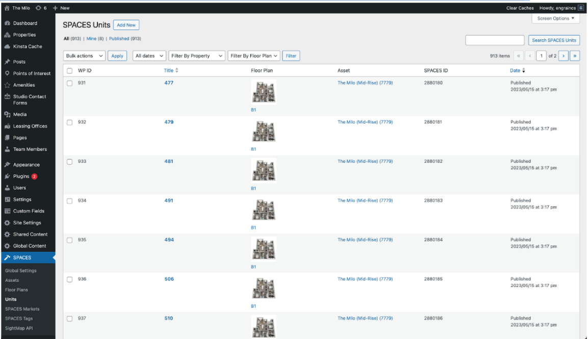
Units
View and manage units in Spaces. Hover over or select a unit title to edit it.
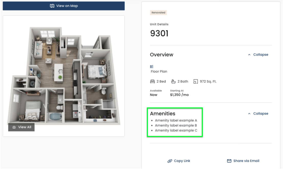
UNIT AMENITIES
You can display a list of unit-specific amenities on the unit details page.
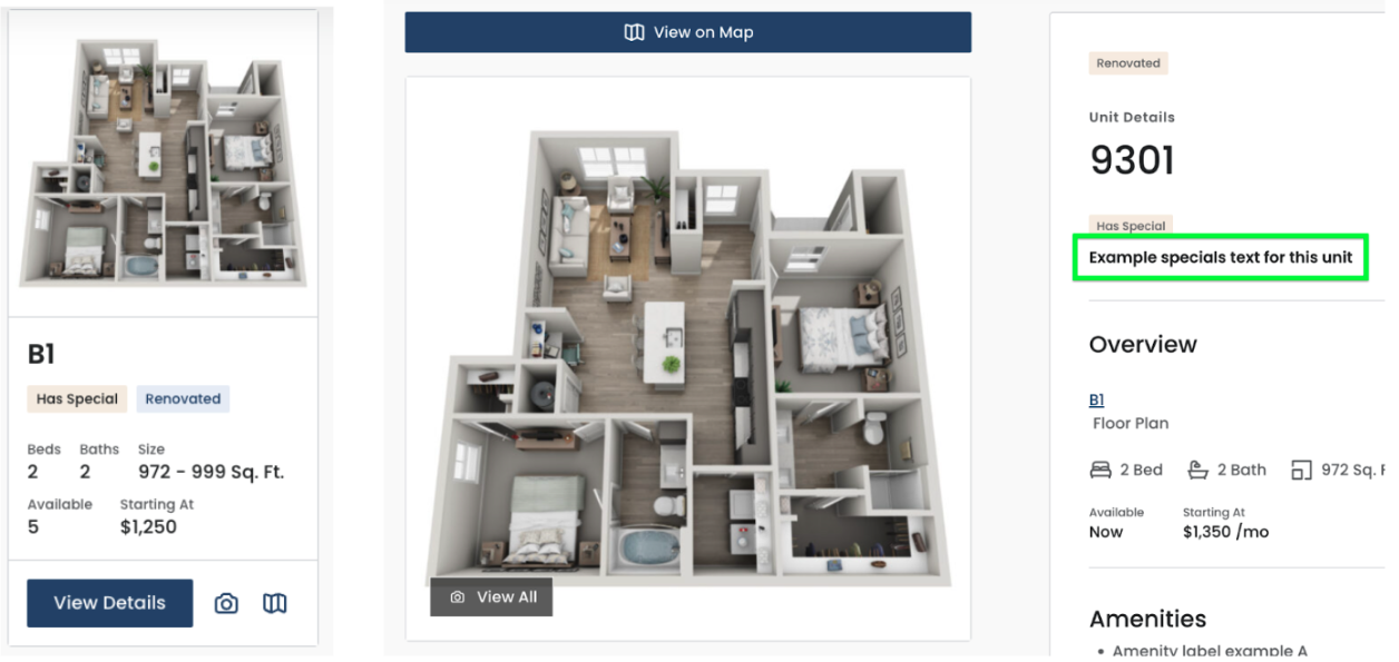
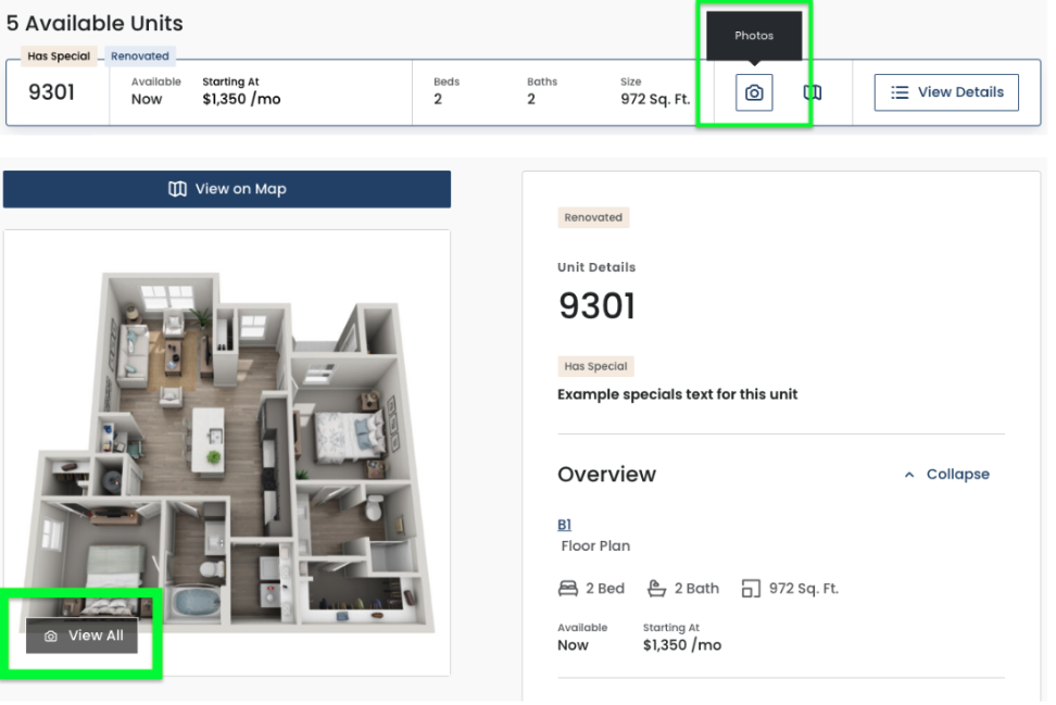
UNIT SPECIALS
Enter text to be featured on the unit details page. Ensure you select its Specials Expiration Date.
UNIT MEDIA
Add unit-specific images that appear after the floor-plan-level images in the unit’s gallery. A unit’s gallery can be accessed from the unit lists and the unit details page.
360 Tour URL links are configured through SightMap and can then appear in the Spaces plugin frontend.
ADVANCED
This tab is used to assign a unit to custom filters. A custom filter must first be created in Global Settings > Filters > Custom Filters.
SPACES
The SightMap Floor Plan ID, SightMap Unit ID, and SightMap Asset ID are automatically populated during the data import and should not be altered.
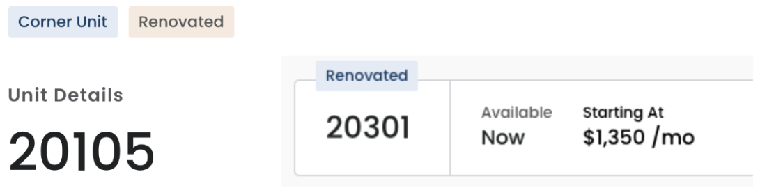
Spaces Tags
These serve as unique markers for units and/or floor plans that appear throughout the plugin. Use them to add emphasis to stand-out offerings or anything you want to feature.
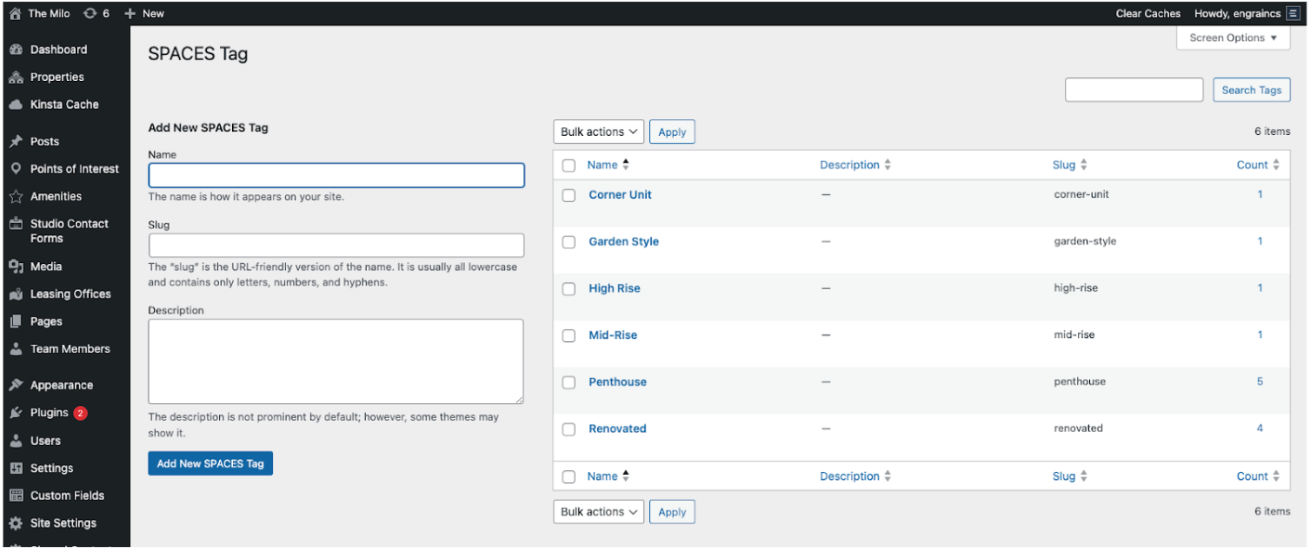
To use Spaces Tags, first create tags in this section. Then navigate to the Edit pages for the applicable units and/or floor plans. Add tags in the righthand module then Update the page.
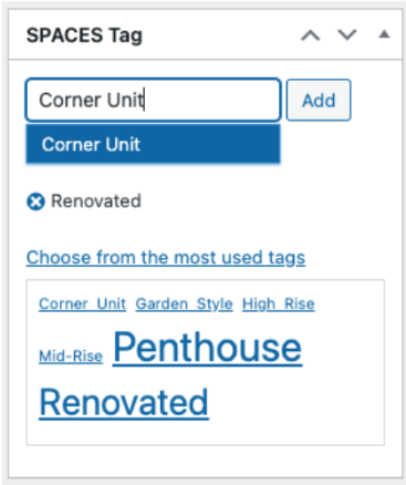
Tag examples: Renovated, Balcony, Penthouse, Corner Unit, Office, Den
Updated 8 months ago